Using Icons for Navigation
Resources
The Myth: Icons Enhance Usability
Icons can sometimes enhance usability, but only when used properly! Relying on only icons for navigation can frustrate and confuse users.
Without labels, icons can be ambiguous. Microsoft discovered the pitfalls when redesigning their menu system in the early 2000s:
One of the problems noticed again and again among non-expert users was that people didn't use the toolbar at all! With the exception of the "Delete" icon (which was perhaps familiar from the Windows 95 shell), people used the menus to reply, forward, and to create new messages.
Different fixes were tried: new icons, rearrangement of the icons, positioning icons under the menus from which the commands came from. In the end, one change caused a total turnaround: labeling the important toolbar buttons. Almost immediately, the toolbars were a big hit and everyone at all skill levels starting using them.
— Jensen Harris via Microsoft, "The Importance of Labels"


What Does an Icon Mean?
We've gotten used to some common shapes (see "Consider What's Universal" later on this page), but many icons are more interpretive. There are 2 factors here:
- The designer has to represent a sometimes-abstract concept with a simple graphic, usually at a small size
- The user has to identify the shapes in the icon, then decode the meaning of the icon based on their own experiences and associations
This can be extra-confusing when different icons can mean the same thing:
[S]aying that the users will know what it is because they have seen it everywhere is like saying that anyone can identify any kind of tree because they have seen a tree before. Just because I have seen a tree doesn't mean I can identify a maple tree. And for icons, this can be compared to seeing a hamburger icon and a house icon and they both mean “menu”.
This “they will know what it means” logic does not work. Not only does it not make sense, but following that logic is literally making an assumption for the user. We are not the users. What we assume they have seen is probably not what they have actually seen. We should never assume the users will understand things because we think its basic knowledge.
— Mary Formanek, "Label Your Icons"
For example, the icons in each set represent the same concept or idea. Their art styles and even the fundamental shapes represented can vary, but somehow the user has to decode the design and its intent. Try guessing what they represent before reading the caption! All icons were sourced with permission from FlatIcon.
Tips for Successful Icon Navigation
Keep It Simple, Sunshine
Straightforward concepts are easier to understand than abstract ones. This is especially important when selecting icons for an application. If you choose to use icons, the fastest-interpreted option will perform better than one that is too detailed.
Consider What's Universal
Despite Mary Formanek's plea, there are a few shapes and symbols considered universal for modern tech. These are a safe bet for the right audience.
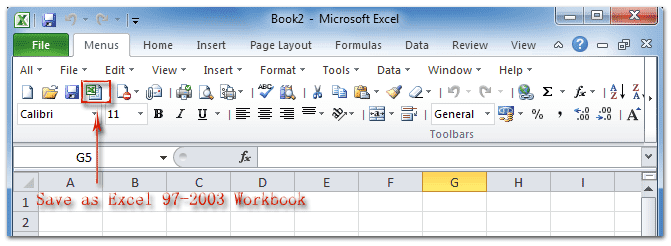
It's not that icons can't work by themselves, but that most people have a fairly limited vocabulary. Floppy disk = save. Printer = print. Play, Pause, Stop, Forward, Back all got defined by tape players from the 1980s. And, yes, if an icon is ideographic enough, it can be infused with meaning and remembered – take the "Apple" menu in Mac OS, for example. But the richness is just not there relative to human language.
— Jensen Harris via Microsoft, "The Importance of Labels"
Social media has also introduced its share of familiar icons, such as Facebook's Like thumbs-up or Twitter's Retweet arrow icon.
Add Labels
Label your icons to make the interpretation and association even easier. Sometimes, a concept is just too complicated for a tiny icon to convey. Pairing the icon with a text label will reinforce your desired interpretation.