Gestalt Theory
Resources
ge·stalt (noun)/ɡəˈSHtält/
An organized whole that is perceived as more than the sum of its parts
— Oxford Languages
For some of you, the concepts may be a review from Digital 2D Design, but they are important when we talk about UI design; these are the principles that make a design work. Gestalt theory is why we can navigate interfaces with multiple levels of content without becoming completely overwhelmed.
Key Principles
There are 4 key properties with gestalt systems: emergence, reification, multistability, and invariance. These properties cover our general perception and the "big ideas" of gestalt. They're supported by other gestalt laws and concepts, so don't worry if your understanding of something feels like it is a match for one of these principles and another concept too.
Emergence
With emergence, we simplify elements to their general forms. Detailed objects can be slower and more difficult to understand, so our minds focus on the simpler options: the overall outline of a form.
Even without a border, we simplify the group of many small dots into one heart shape.
Other principles and concepts discuss our ways of grouping elements, but emergence is specifically looking at that "bigger picture" and eschewing too much detail for the simpler explanation.
When we see an image, we first attempt to identify it by its outline or general shape. We then compare that to the objects in our mental inventory. This is why our brains recognize simple, well-defined objects more quickly than complex ones.
From an evolutionary perspective, this makes a lot of sense. If you’re out wandering in a jungle, it’s in your best interest to be able to quickly identify a leopard so you don’t get attacked. It would be much less useful for you to first identify the individual shapes of its spots.
— Sara Dholakia, "The Intersection of Psychology & Design"
Reification
With reification, we recognize and deduce more information that what is present; our brains fill in the gaps. Along with closure, this can come in handy for logos, icons, or illustrations.
Multistability
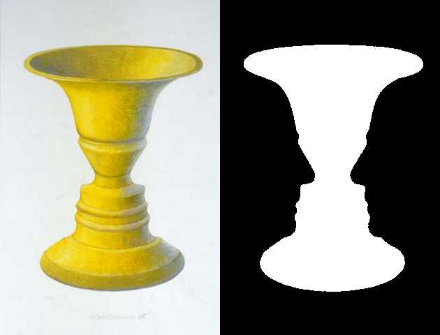
We are able to alternate between multiple ambiguous interpretations; neither one is "right". This concept is common in optical illusions – and sometimes clever logos.
Invariance
We can recognize objects even when they are rotated, scaled, stretched, lightly distorted, or shown in different lighting.
Imagine if you could only recognize someone you knew if they stood directly in front of you and faced you, but you couldn’t recognize them once they turned in profile. Despite the different visual perspective we can still recognize people.
— Steven Bradley, "Design Principles: Visual Perception And The Principles Of Gestalt"
Principles & Laws of Gestalt
This list is non-exhaustive; over time, some new principles have been identified. For a look at some of the other principles, read "Design Principles: Visual Perception And The Principles Of Gestalt" on Smashing Magazine.
Proximity
Nearby objects are perceptually grouped together. Space between objects (and groups of objects) can be used to show that their content does not belong together.
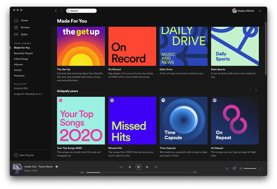
The Spotify "Made for You" category has many playlist cards with short descriptions. We are able to group the description to the correct card due to their close proximity, and there is enough of a gap between the images that we recognize them as separate elements.
The horizontal gap between images is greater than the vertical gap between the images and their descriptions, so we do not interpret this as a "row of images" and a "row of text" underneath.
Common Region
Some old-school interpretations place this within the realm of Proximity – newer laws, including this one, were added to gestalt theory later on. Common Region uses boundaries such as background colors or borders to help separate and group content. These boundaries create "containers" or "blocks" for your content and are heavily used in interface design.

Common Region is helpful when white space alone isn't enough to keep content separated, but too many harsh boundaries can make a design look cluttered. Worse, users might reach the end of a region and think that they've reached the end of the page or screen. Design elements can inform the user that there is still content to discover.
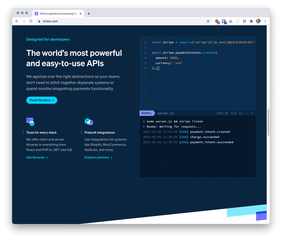
Read more: Nielsen Norman Group, "The Principle of Common Region: Containers Create Groupings"
Similarity
Elements that are similar are grouped together. You can build similiarity with size, color, shape, and more.

Closure
Closure is a popular choice for design elements, especially logos and illustrations. We "fill in the blanks" to create a whole element. Effective use of closure gives us just enough information to see the intended design; without enough details, closure could be interpreted in too many ways.
The original NBC peacock logo was much busier than its current design. The peacock was outlined in front of its rainbow feathers. In 1986, the outline was removed and the peacock's body was implied through clever use of a triangle of negative space and the small beak overlapping the purple shape.
Continuation
When we see elements forming a path, we treat those elements as a related set. We can also continue to navigate that path.
This one is huge on mobile! We can take advantage of horizontal scrolling to show additional content without taking up as much vertical room. Once we see enough elements creating a horizontal path, we understand that we can scroll to see more, especially if we see the last one partially cut-off.
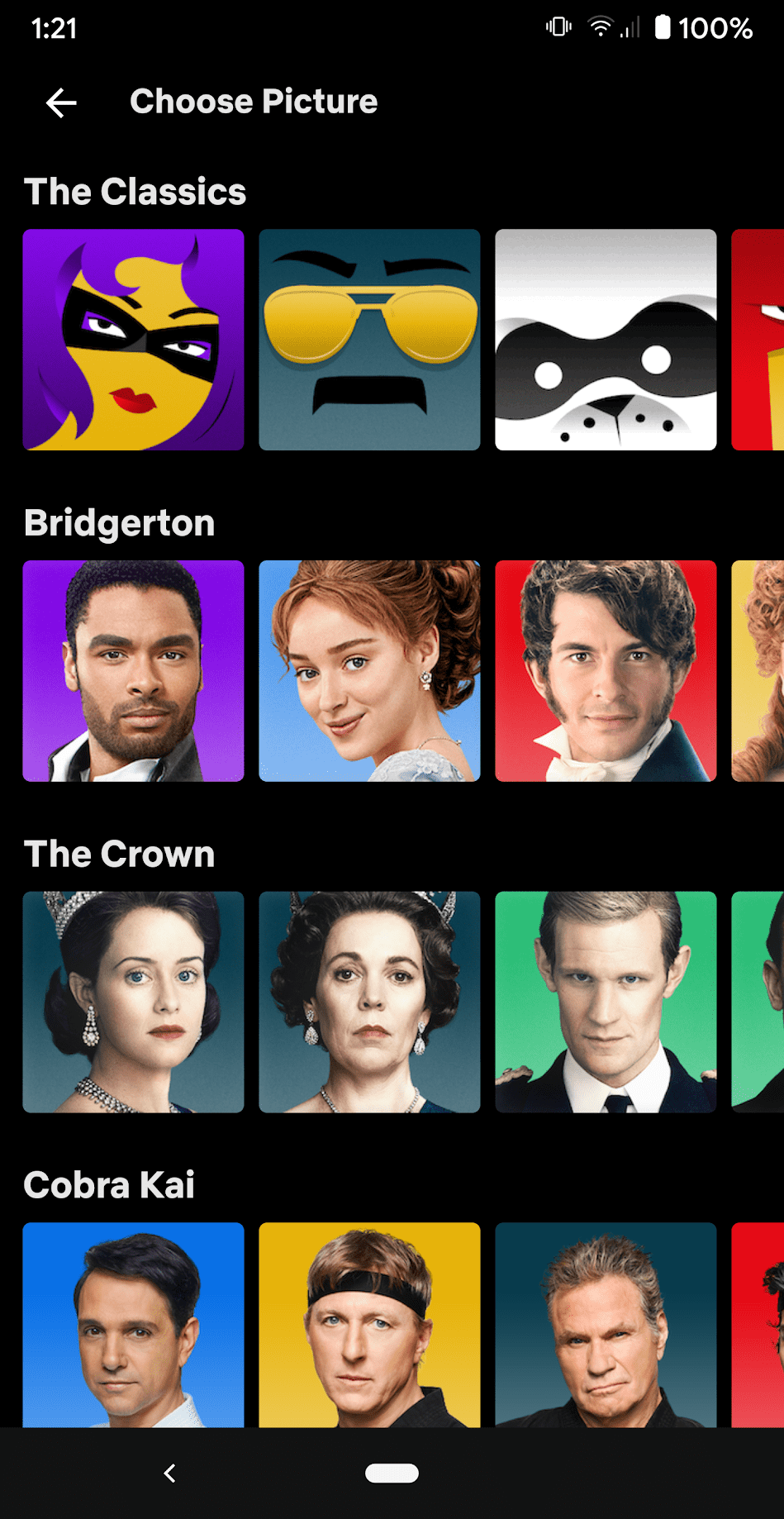
Avatar selection on Netflix uses horizontal and vertical continuity, as there are many more rows to choose from
Interface © Netflix
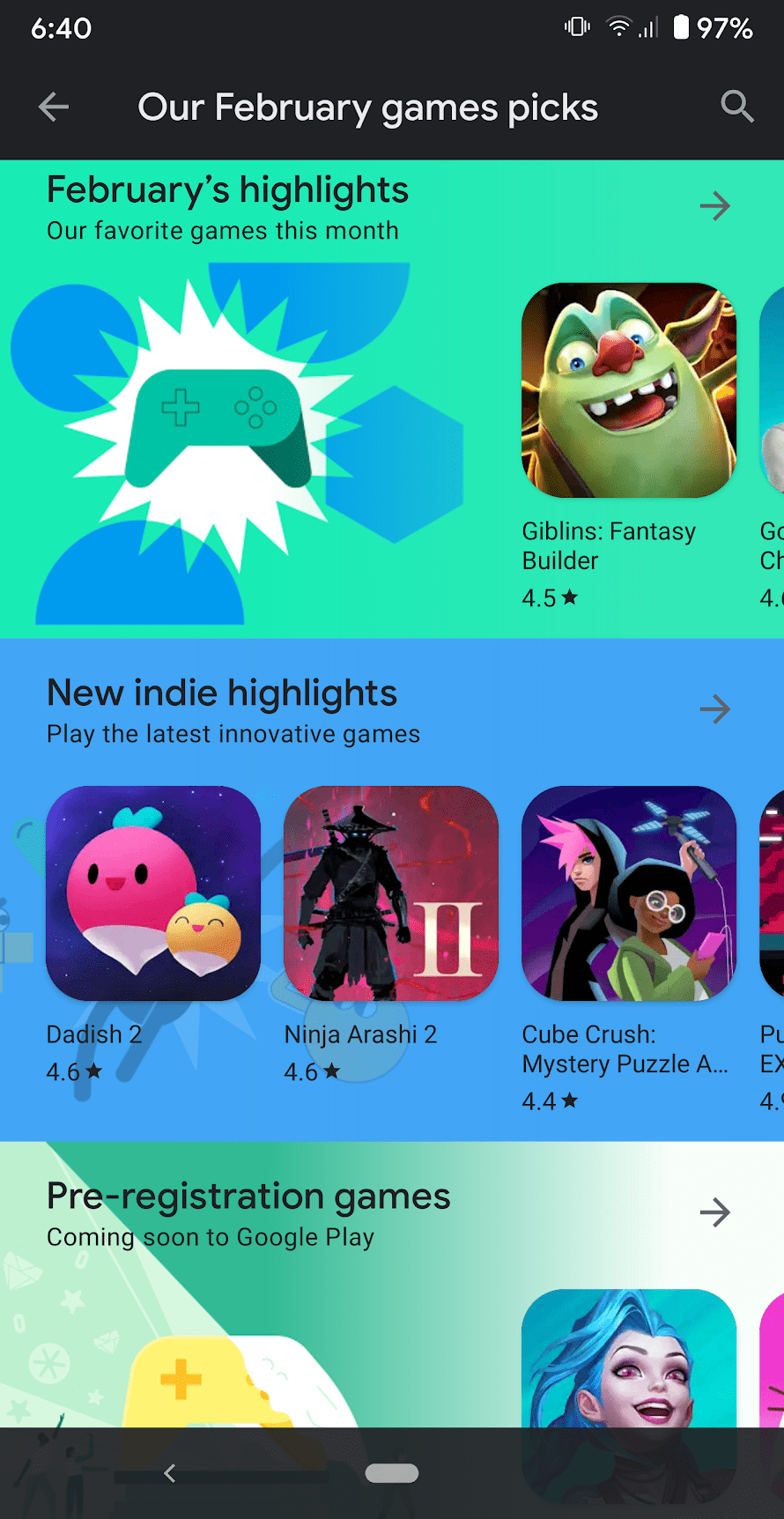
Google Play Games has horizontal and vertical continuity
Interface © Google Play
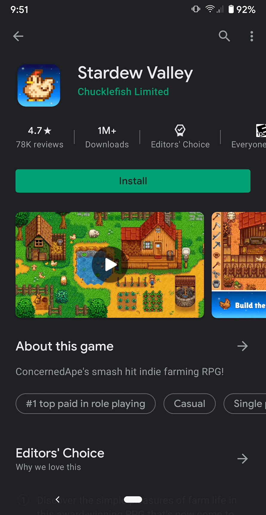
Google Play Games features many rows of content cut off horizontally
Interface © Google Play
Common Fate
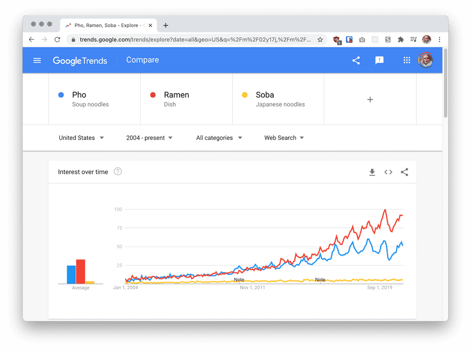
When elements are moving towards the same direction, we perceive them to be related. Another very similar related principle is Parallelism, when elements are not only moving together but are parallel as well.
Prägnanz (Good Form)
Our brains like simplicity. We can see ambiguous or complex designs and interpret them as simpler pieces or a simpler whole.
For instance, consider the Olympic Rings, which also display good similarity and closure. Instead of seeing their complex shapes with cut-out gaps, we like the easier answer: intertwined, overlapping circles. Though there are 3 unique shapes among the 5 rings (i.e. they are not identical copies), we understand them to be individual, similar components of one group together.
We can feed this need for simplicity with our design choices, too. These charts display the same information, but it is faster for us to process information from the organized, sorted chart than the more dynamic-looking one.
Figure-Ground Relationship
This is the relationship between a form/figure and its background, or the interaction of positive and negative space.
A reversible or ambiguous figure-ground relationship can display multistability and alternate between multiple interpretations.
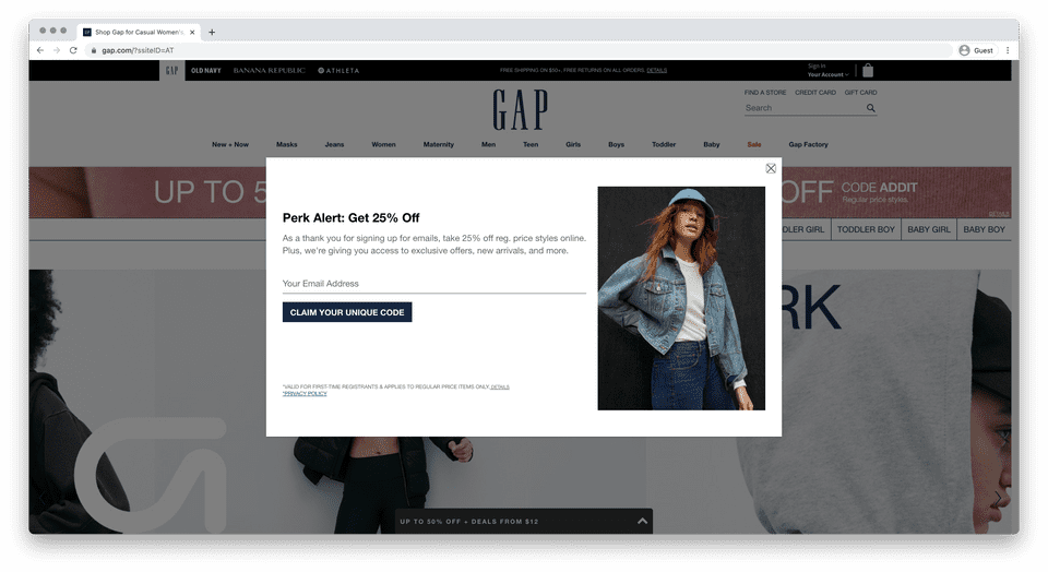
Figure-ground can move beyond illustrations. Below, website elements are layered to focus attention. We know which elements are on top because of the partially-transparent shadow (often called a "curtain" in this treatment) covering up the rest of the page, or the ground. Since the pop-up window is not covered by this curtain, it must be stacked on top of it. This effectively designates the pop-up window as a stable figure on top of the rest of the page.
Sample Interface: LOCUS
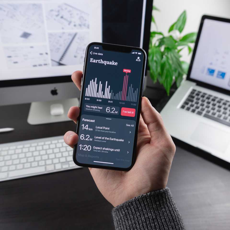
Let's talk about this design. There's a lot of information going on in this app screenshot, but already, our minds are breaking up the interface into smaller sections:
Navigation bar
Title
Chart
"You might feel..." panel
Call-to-action button
Forecast panel
...and those sections can even be broken down into smaller pieces. This screen could appear to be very busy with different formatting, but Gestalt principles make it less overwhelming.
We mostly separate those groupings by common region. The navigational bar is one wide row, followed by the title and chart section, and then individual panels and buttons grouped together with slightly different background colors.
The chart could just be a random group of lines, but because they share a common fate, they are perceived as related. Within the chart, the bars use similarity with their colors to show which sets are grouped together.
Within the Forecast panel, we see 3 distinct informational sections that are grouped by their similarity. Each section shows good continuation to guide us from left to right. We can enforce that continuity by centering or aligning items vertically. Here, the "Local Point" text aligns to the top of "14km" and "51 km from your location" aligns to the bottom, creating a tidy appearance and an implied horizontal line across the screen.
The whole design uses a greyish-blue except for the "warning" bars and "I've felt it" button, which both use the contrast of red to create a focal point that urges the viewer to use caution (top bars) or take action (by tapping the button).