Choosing Fonts
Typography can set the mood for your whole design. It serves a dual purpose as something visually appealing but also a conveyor of information.
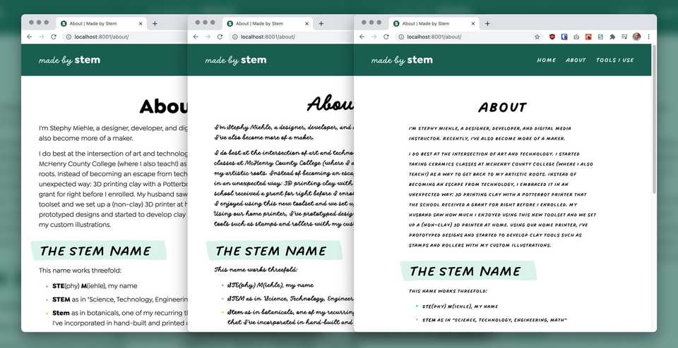
Fonts shine in different contexts and there is no "best" font; that's like asking for the best tool in the toolchest. Instead, what is appropriate for the job at hand? First, you need to decide where the font is going to be used.
Accent or Body?
You can use one font family for your entire design, but it's also common to see a mix of accent fonts and body fonts.
Body fonts are your main workhorse fonts; they can be big or small and are appropriate for long passages of text. Your body font needs to be usable and readable; anything too decorative can be uncomfortable for your users to read.
Accent fonts are used like spices; just a little bit can go a long way. Since these fonts can be used for shorter text or at larger sizes, you can choose something more stylized. Accent fonts are great for headlines and short, occasional bursts.

Weights and Italics
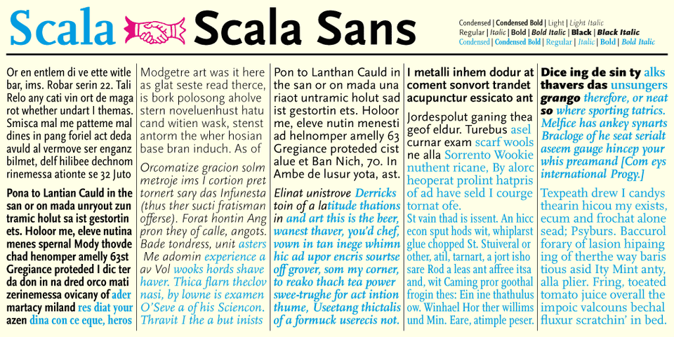
A typeface (or font family) can contain multiple individual styles, each of which is called a font. This gets confusing, as others might refer to a font as the whole set. Pedantics aside, the distinction is actually important here since typefaces with multiple fonts are more flexible to work with than single fonts.
For headlines and as accents, you can potentially get away with a single style.
For body fonts, look for at least a standard weight, standard weight in an italic style, and a bolder weight.
Superfamilies
Superfamilies are large font families that might contain multiple styles, weights, and even classifications. For instance, the font Roboto is available as a slab serif, sans-serif, and monospace (code) font, all with multiple weights and italics.
Choosing a font from a superfamily increases typographic possibilities because the styles are all complementary. Many of these superfamilies are used in editorial contexts. The variety of styles and weights is useful when text needs to be fine-tuned for readability in everything from the smallest of captions to huge headings.

Variable Fonts
Variable fonts are relatively new to the scene but bring a lot of potential. Instead of having separate font files for each weight, these variable fonts can contain multiple styles in just one file. Below, the font "Roboto" has an axis for the font weight as well as the width of its characters. Each axis can be controlled independently and set to any value between its minimum and maximum, not just the preset values seen in traditional font families.